Demo: Tabbed Interface
Explanation
This example demonstrates a common tabbed interface, styled only with CSS3 (no images are used). The tabs don't actually do anything, as that would require extra JavaScript beyond the scope of this demo.
In this demo border-radius is used to give the tabs rounded corners on the top. Also, box-shadow
gives the active tab and the content container a subtle glow, which creates a sense of depth and makes the inactive
tabs look like they are sliding behind the content box. The tabs have a hover effect using a linear gradient.
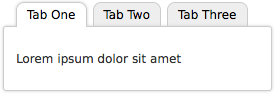
Screenshot
This is a screenshot of the intended rendering, captured in Firefox.
Live Demo
This is the live code as rendered by your browser. If you use IE, you can toggle the PIE behavior on and off.
Code
HTML markup
<div class="tabBox">
    <ul class="tabs">
        <li class="selected"><a href="#">Tab One</a></li>
        <li><a href="#">Tab Two</a></li>
        <li><a href="#">Tab Three</a></li>
    </ul>
    <div class="content">
        <p>Lorem ipsum dolor sit amet</p>
    </div>
</div>
CSS
.tabBox .tabs {
    margin: 0;
    padding: 0 10px;
    overflow: hidden;
    margin-bottom: -1px;
    height: 2.25em;
}

.tabBox .tabs li {
    float: left;
    list-style: none;
    margin: 0;
    padding: .25em .25em 0;
    height: 2em;
    overflow: hidden;
    position: relative;
    z-index: 1;
    border-bottom: 1px solid #FFF;
}

.tabBox .tabs li.selected {
    z-index: 3;
}

.tabBox .tabs a {
    float: left;
    height: 2em;
    line-height: 2em;
    -webkit-border-radius: 8px 8px 0 0;
    -moz-border-radius: 8px 8px 0 0;
    border-radius: 8px 8px 0 0;
    background: #EEE;
    border: 1px solid #CCC;
    border-bottom: 0;
    padding: 0 10px;
    color: #000;
    text-decoration: none;
    behavior: url(/pie/PIE.htc);
}

.tabBox .tabs .selected a {
    background: #FFF;
    -webkit-box-shadow: #CCC 0 0 .25em;
    -moz-box-shadow: #CCC 0 0 .25em;
    box-shadow: #CCC 0 0 .25em;
}

.tabBox .tabs a:hover {
    background: -webkit-gradient(linear, 0 0, 0 70%, from(#EEF), to(#FFF));
    background: -webkit-linear-gradient(#EEF, #FFF 70%);
    background: -moz-linear-gradient(#EEF, #FFF 70%);
    background: -ms-linear-gradient(#EEF, #FFF 70%);
    background: -o-linear-gradient(#EEF, #FFF 70%);
    background: linear-gradient(#EEF, #FFF 70%);
    -pie-background: linear-gradient(#EEF, #FFF 70%);
}

.tabBox .content {
    clear: left;
    position: relative;
    z-index: 2;
    padding: 2em 1em;
    border: 1px solid #CCC;
    background: #FFF;
    -webkit-border-radius: 3px;
    -moz-border-radius: 3px;
    border-radius: 3px;
    -webkit-box-shadow: #CCC 0 0 .25em;
    -moz-box-shadow: #CCC 0 0 .25em;
    box-shadow: #CCC 0 0 .25em;
    behavior: url(/pie/PIE.htc);
}